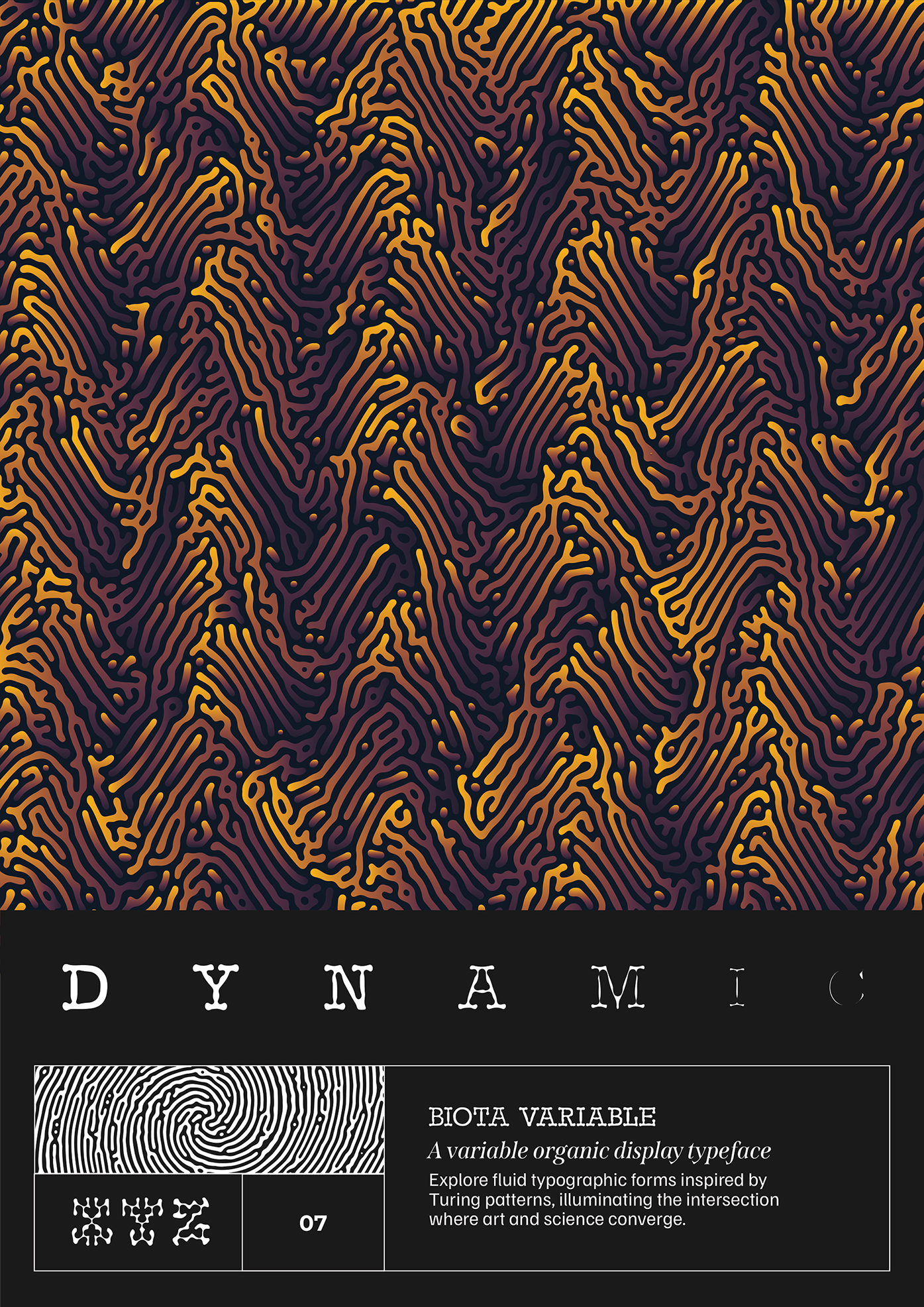
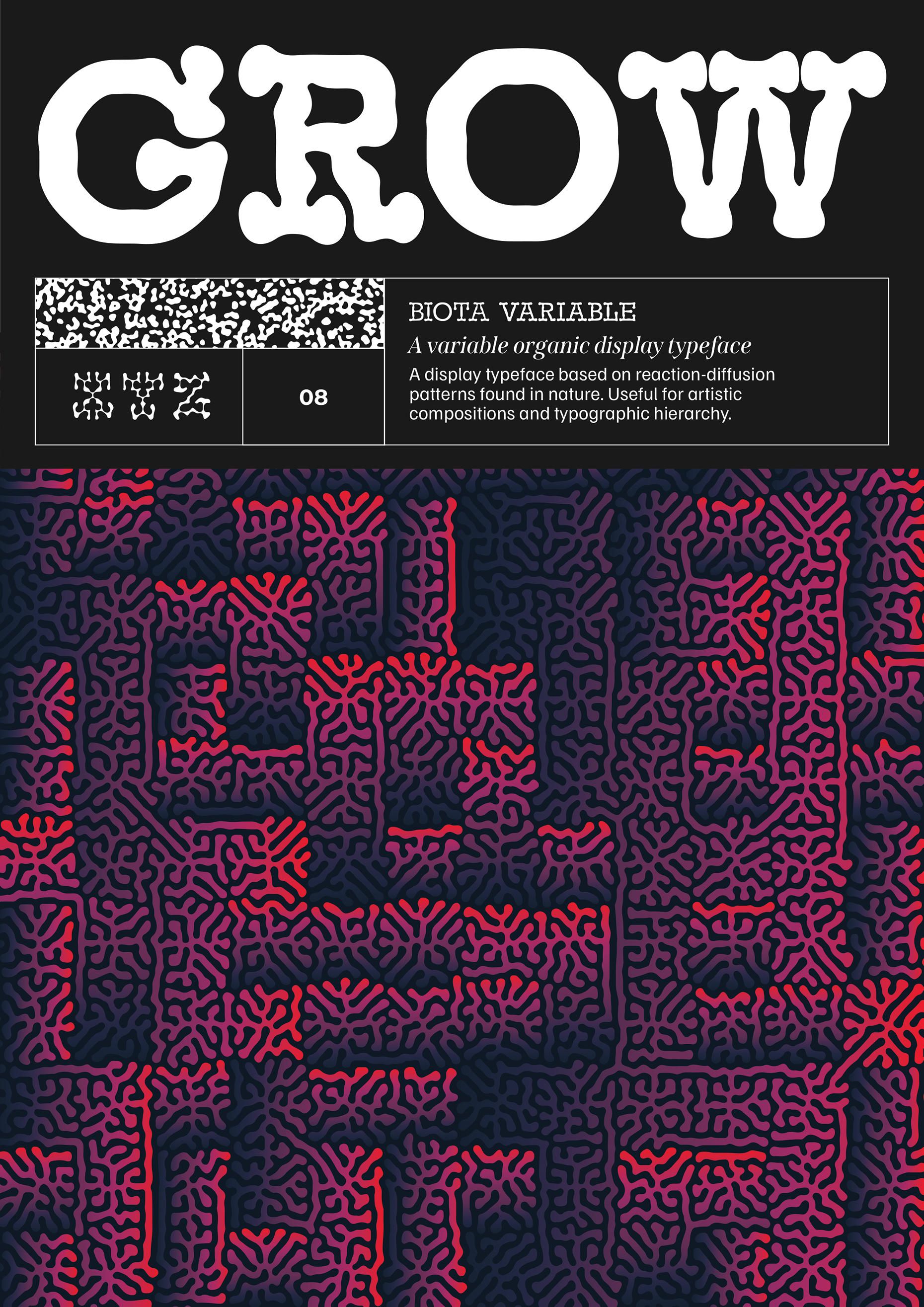
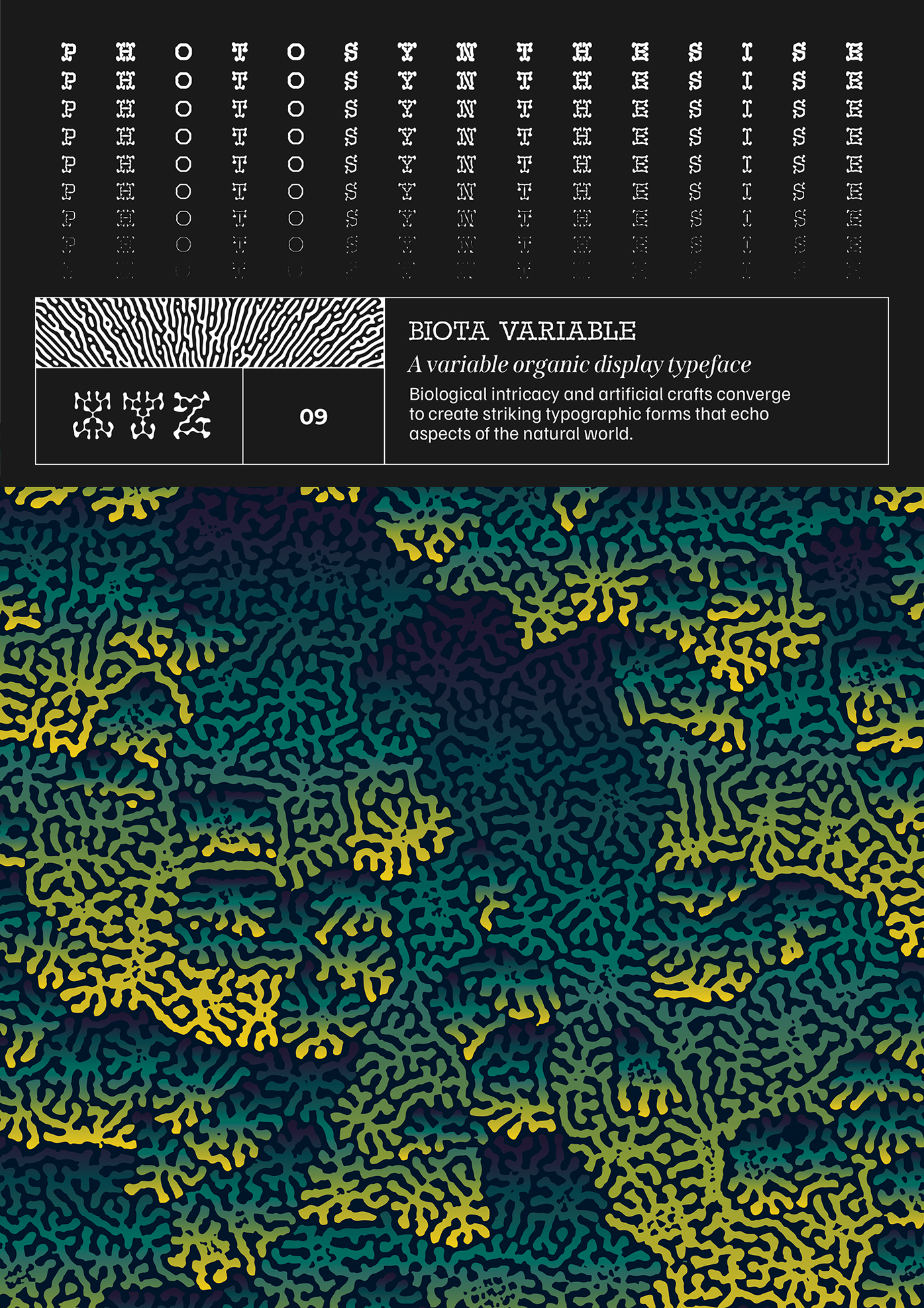
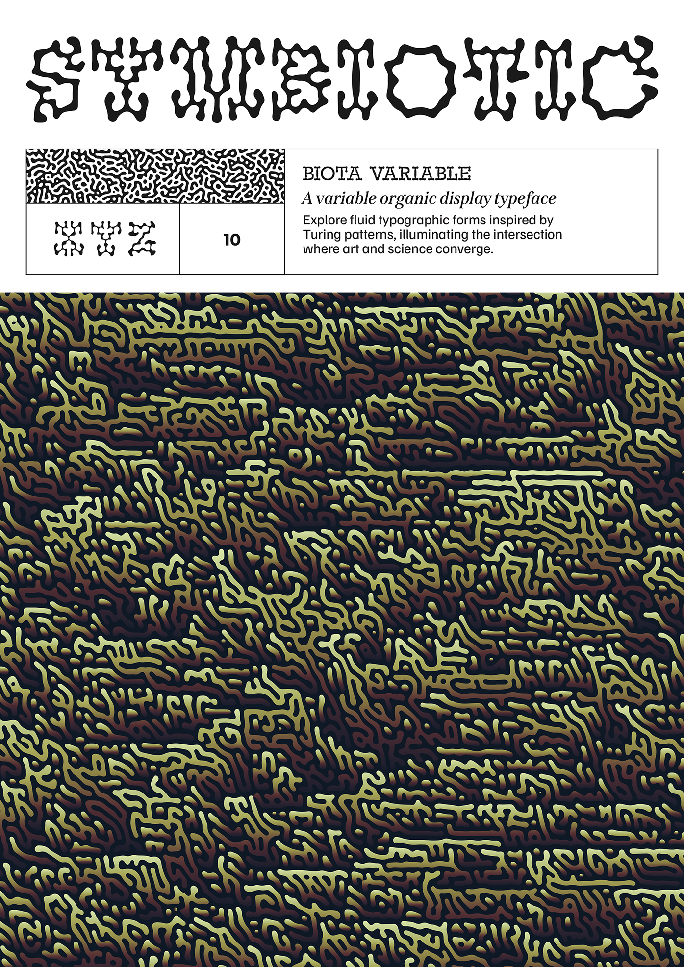
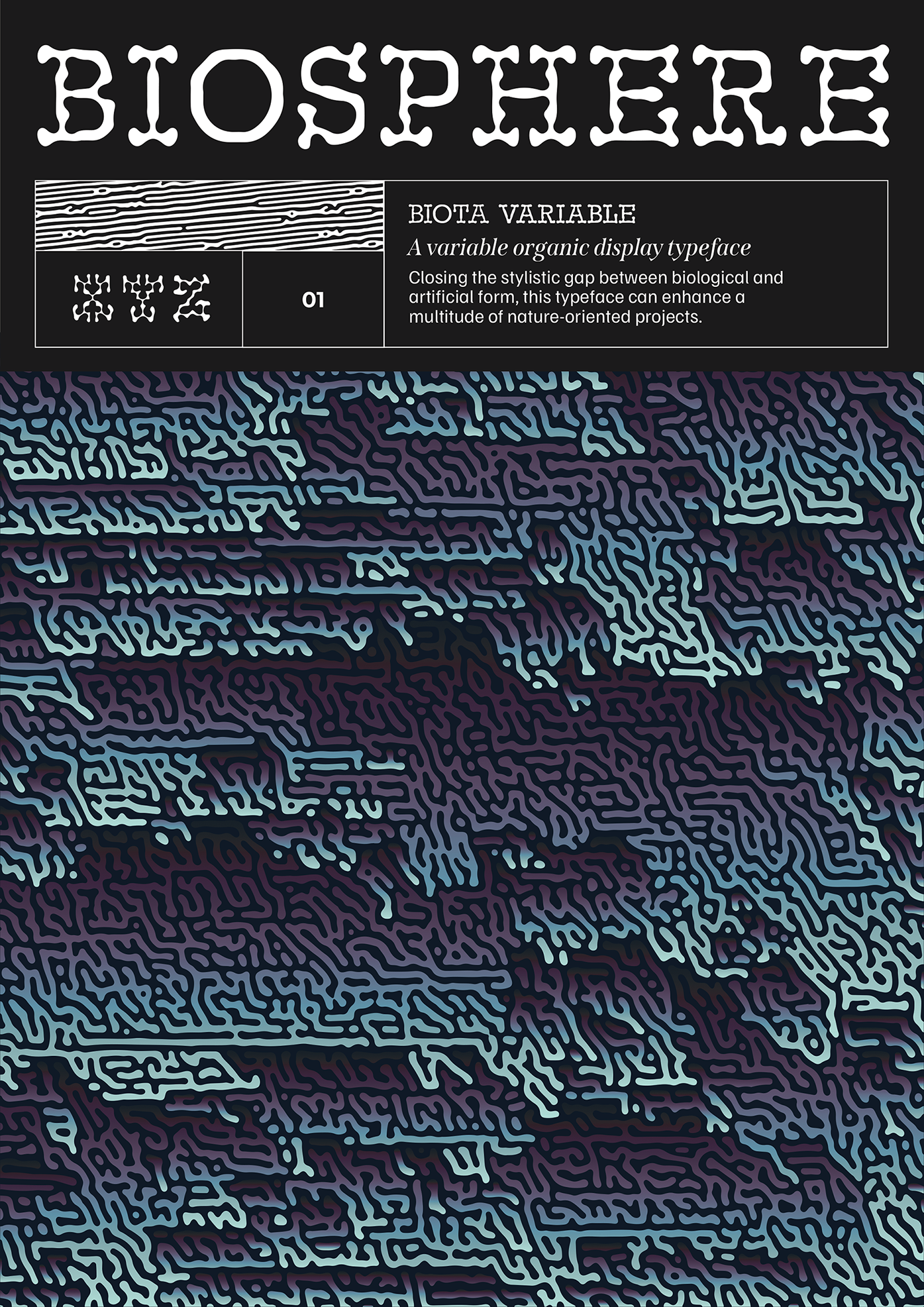
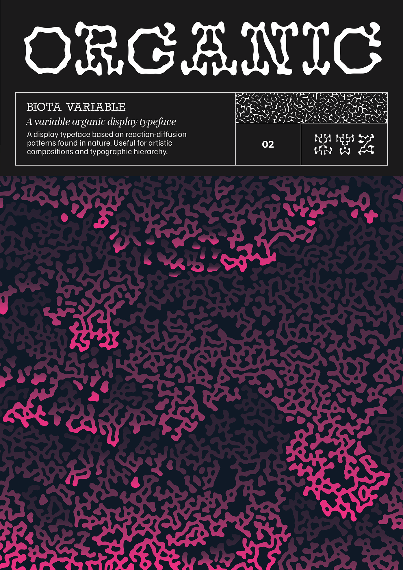
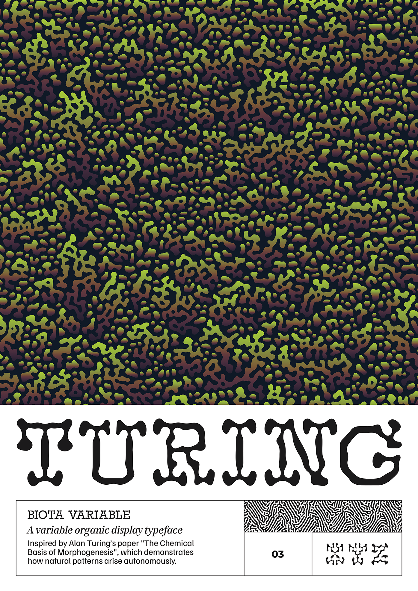
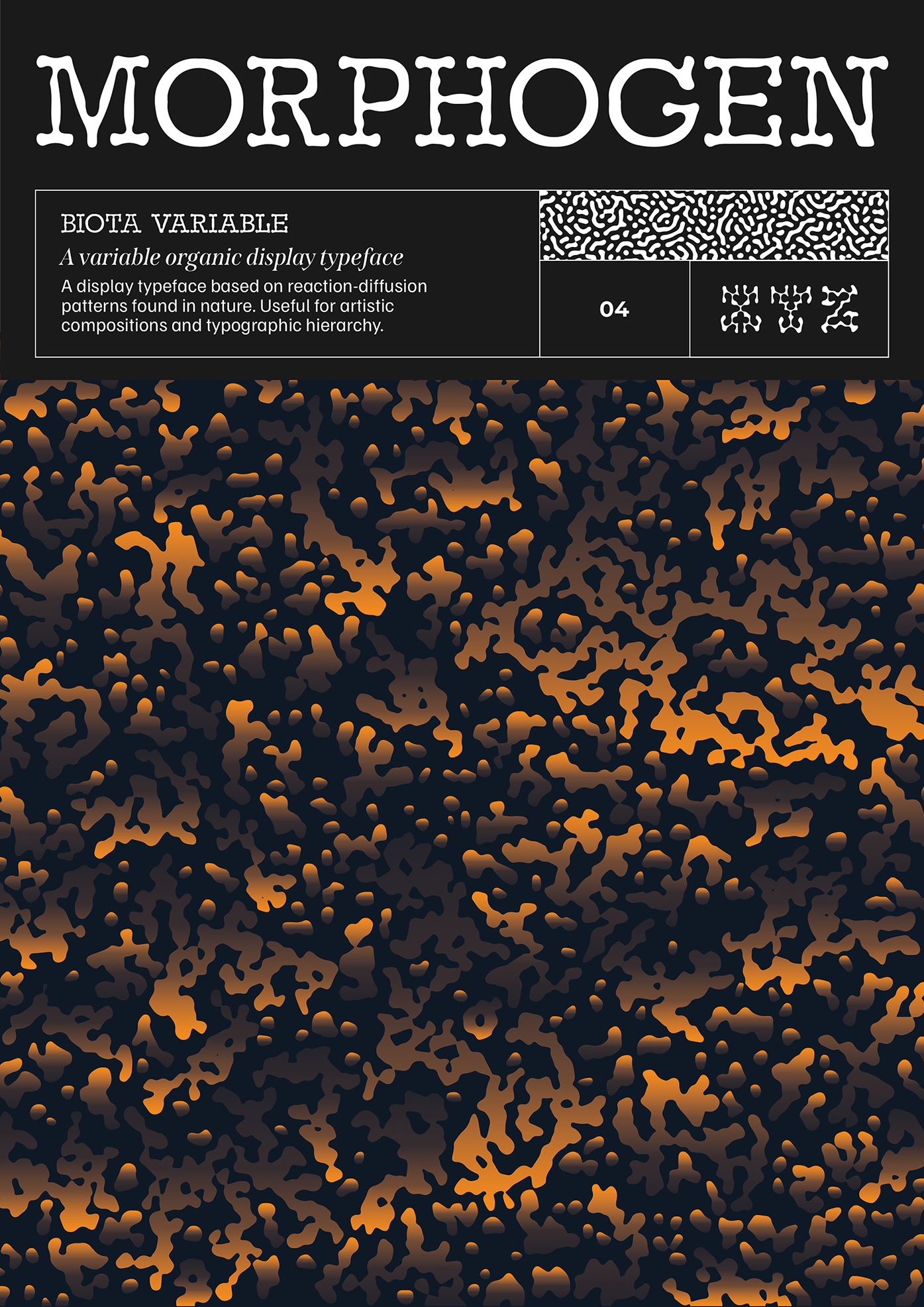
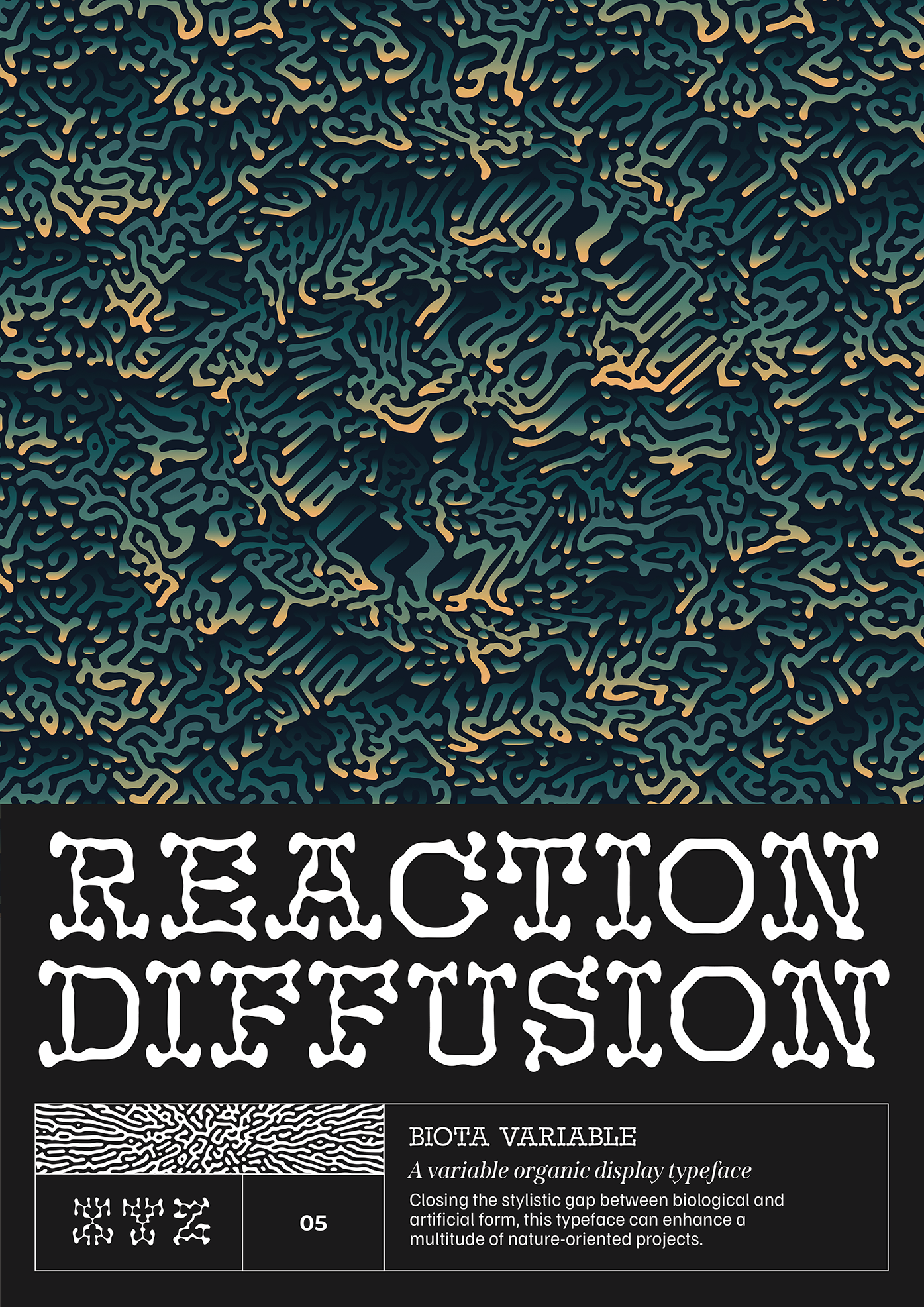
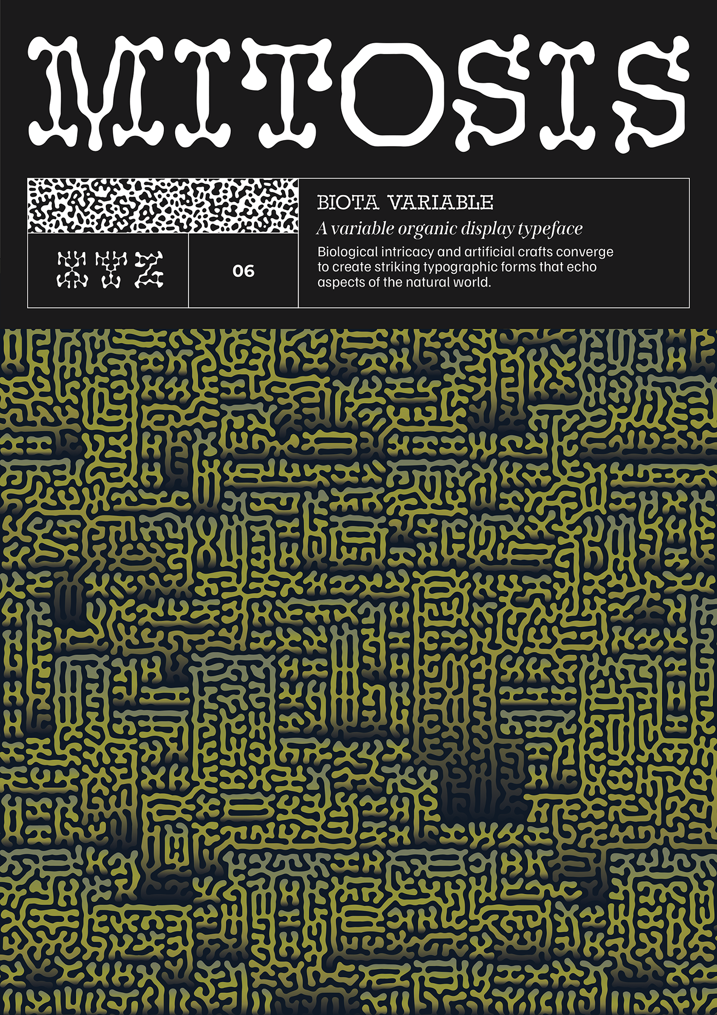
This project was developed as my response to the ISTD 2024 brief 'The Line', which invited participants to explore the concept of lines through typographic design. My interpretation, titled 'Biota' is a variable typeface inspired by reaction-diffusion patterns found in nature, specifically the organic systems described in Alan Turing's paper 'The Chemical Basis of Morphogenesis'.
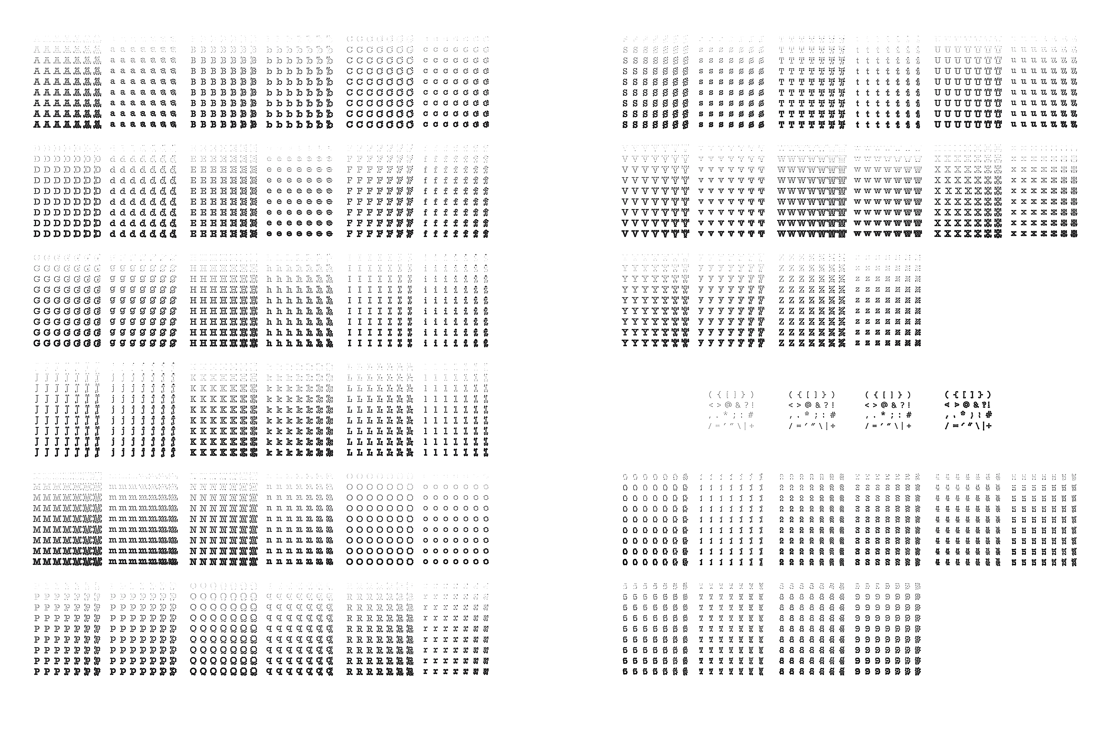
The aim was to use typography and supporting visuals as a medium to examine the line between artificial and organic forms. Rooted in classic slab serif structures, Biota evolves through nine weights and seven stylistic variations, producing a total of 63 unique font styles. This flexibility allows it to move seamlessly from clean and structured to fragmented and expressive.
The typeface is supported by a comprehensive visual system demonstrated in a set of 10 posters. These elements work together to illustrate how typographic forms can emerge naturally, reinforcing the project's conceptual foundation. Biota is particularly suited to work that intersects with biology, generative design, or typographic experimentation.
The typeface is supported by a comprehensive visual system demonstrated in a set of 10 posters. These elements work together to illustrate how typographic forms can emerge naturally, reinforcing the project's conceptual foundation. Biota is particularly suited to work that intersects with biology, generative design, or typographic experimentation.
Styles
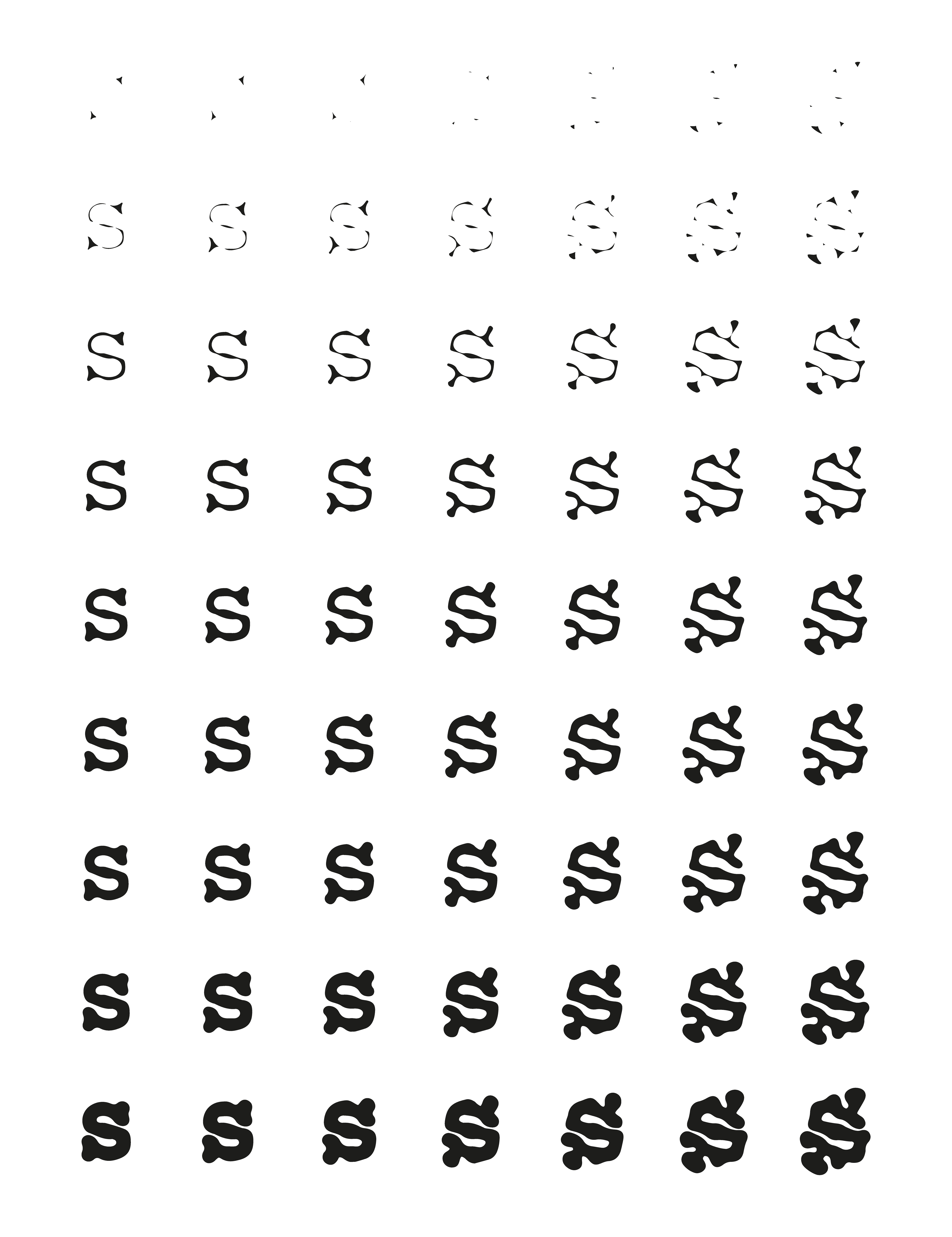
Seven style variations take the typeface from legible to distorted, branching out and filling the space in a balanced way that results in unique forms.
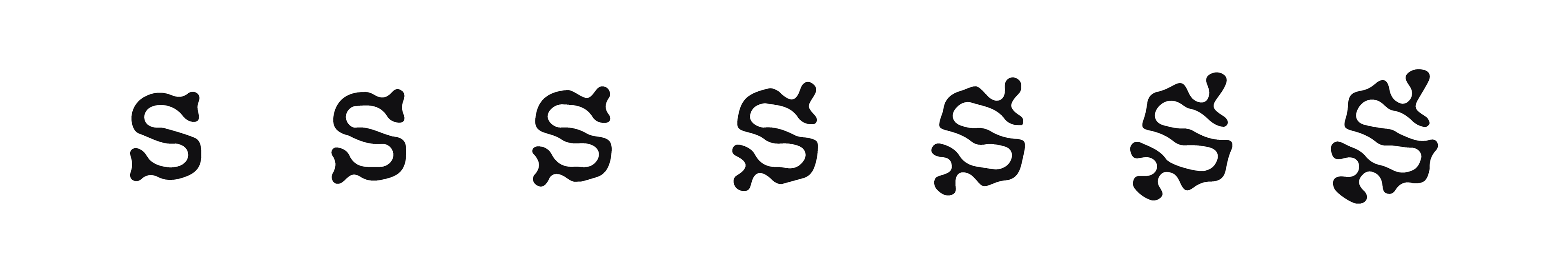
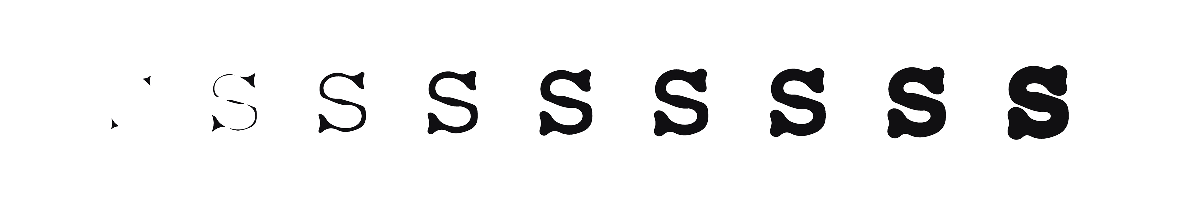
Weights
Nine weight variations allow for a smooth transition between the two ends of the scale, from fragmented to bold, with a soft but clean regular version.
Combined
Together these two axes of weight and style produce 63 font variations.
1,638 Letters
630 Numbers
1,575 Punctuation marks
3,843 Characters in total